While continuing my CFP course on Investment Planning, their sections on portfolio construction and asset allocation contained several updated 2025 versions of charts (including data through the end of 2024) that I have been posting on this site since the early days. Crazy that I first started looking at this stuff in the 2000s and now the 25-year charts barely go back that far!
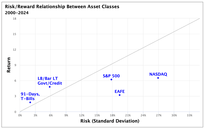
1. Based on the past 25 years of performance (2020-2024), here is a chart of annualized return vs. standard deviation (volatility, a proxy of risk).
Takeaways: International stocks have had a very bad run, performing worse than long-term US bonds. T-Bills/Cash staked out their usual position as low risk/low return. I would also note that the difference between a 7% average annual return and a 3% average annual return over 25 years is huge, and this chart doesn’t really communicate that.
2. Here is the range of S&P 500 stock returns for various holding period lengths from 2020-2024.
Takeaways: Your range of average annual returns narrows as your holding period lengthens.
This fits with the feeling that the swings in the past seem to fade away over time. But that doesn’t change the fact that going forward, your (hopefully large) stock portfolio in retirement might still drop by 40% in a single year.
3. Here is a bar chart of the top performing asset classes for various holding period lengths from 1926-2024.
Takeaways: For 25-year periods, 99% of the time stocks win. But a lot of those were overlapping 25-year periods. You have to consider how confident you are using 100 years of looking back to predict 50+ years into the future.
4. Here is the range of annual returns for the major asset classes from 2000-2024.
Takeaways: As you might expect, stocks are the most volatile by far.
5. Here is the Growth of $1 chart from 2020-2024 for selected major asset classes.
Takeaways: Long-term bonds actually beat stocks for a long time, as this period started right during the Dot-Com crash.
But stocks still came back to win by a significant margin. Cash barely keeps with in inflation, so the inability to keep up with inflation is its own risk.
6. Here is the impact of blending different percentages of stocks and bonds on their combined performance and volatility.
Takeaways: These charts do change with the time period, but they usually show that owning around ~20% in stocks can actually give you a better return with the same amount of volatility (risk proxy) rather than owning zero stocks. So even if you are very risk-averse, owning at least some stocks is often advised. On the other end, there is often diminishing returns when you go above ~80% stocks.
Disclaimer: This story is auto-aggregated by a computer program and has not been created or edited by finopulse.
Publisher: Source link